Princess Cafe Website Redesign
Timeline: October 2023 (2 weeks)
Software: Figma
Role: Solo designer
Overview:
For this project, I chose to redesign an existing website that had some web design issues. I decided to go with a local family owned and operated cafe in Waterloo called Princess Cafe. The purpose of the site was to allow customers to place orders online and pick up in-store. My goal was to enhance the user experience and visual appeal, with easy-to-use and intuitive navigation in mind. In particular, to improve the user experience when shopping and placing orders.
Sitemap:
To better understand the existing structure of the site and identify the problem, I created a sitemap of the existing site to help me visualize the structure of it. With this sitemap, I was able to find that the hierarchy of the existing site was not clear and needed to be reorganized in terms of content and navigation elements.

Current website's sitemap
I then redesigned the sitemap. The redesigned site will be able to improve usability, the navigation experience and overall organization of the site, making it easy for users to find the information they are looking for and navigate it.

Revised website's sitemap
Problems and Redesign
Experience 1: Homepage
Founded Problems:
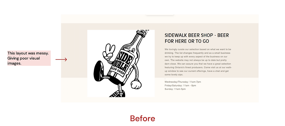
The homepage needs more information hierarchy. The original website is a single - page website that contains all the sections in one page, so that users had to keep scrolling the screen to find the information they wanted.
My Redesign:
-
Organized them in a logical hierarchy to help users understand the structure of the website and easily locate relevant information.
-
Added a navigation bar and a search button to make the page neater and user friendly.
-
A product overview to increased immediate visibility that captures users' attention and creates a positive first impression.
-
Chose to use a warm colorway to maintain consistency throughout the interface to convey the warmth, romance, and relaxation of the cafe's style and mood.

After
Experience 2: Menu "Search"
Founded Problems:
The Menu is one of the biggest pain points in the original website. The horizontal navigation bar would likely cause inefficiency for navigating the website. There were also more than a hundred options under the beer category. However, there were no search button on this page. How can users find the products they want just through clicking the view more button? This was a huge inconvenience for the cafe's customers and made browsing or shopping unpleasant.
My Redesign:
-
Changed the layout of the categories from horizontal to vertical to improve readability.
-
Added a search box and a page navigation bar to allow users quickly find products and browse the page.

After
Experience 3: Menu "Add to Cart"
Founded Problems:
In this product detail page, customers can select the number of items and different types of bread. However, the original design of the drop-down list was quite negligible and the options in the drop-down list lacked recognition.
My Redesign:
-
Used buttons instead of drop-down list for selecting options. This makes the flow more intuitive, and users have more take control of the system.
-
Added an overlay frame for confirmation messages and a cart button that takes users directly to the cart interface to checkout when they successfully add a product to the cart.

After
Experience 4: Cart
Founded Problems:
The shopping cart interface is missing a lot of buttons to help users change item selection, for example, there is no save for later button to help users to keep the item in the shopping cart for payment later or separate payment. Also, if users want to edit or update the items in the cart, they can only re-add a new item instead of editing an already added item. Users will have to go through an additional step of deleting an item.
Additionally, the original site had put in-store pickup, which was supposed to be information, in the shopping cart as an item, which could be confusing. Moreover, the fact that users can still click the checkout button and be taken to the checkout page when they haven't added any items to the cart shows that error prevention has not been taken into account.
My Redesign:
-
Clarify there is only pickup service for the cafe by adding a reminder on the page.
-
Created a "save for later" tick box and edit button. The process of updating options in the cart is made more efficient by using the information previously filled in by users, which help users to know what the options are rather than having them recall them.
-
Redesigned the empty shopping cart interface to give the user a clear guideline.

After
Experience 5: About
Founded Problems:
The content of the original about page was placed in various places on the site, such as the footer and homepage, making it difficult for customers to quickly understand the background of the store and the concept that the owner wanted to convey. In addition, it was visually unappealing because of the typography.
My Redesign:
-
Added a separate about page, reorganized information and photos
-
Put the hours of operation in the footer.
After
Experience 6: Footer
Founded Problems:
The footer of the original site was not organized and categorized. It was also missing some essential information, such as opening hours.
My Redesign:
-
Reorganized the information into 3 categories, Location, Contact Information and Opening Hours.
-
Added the footer to every pages.

